From the June 2025 issue of Apollo. Preview and subscribe here.
When perusing the back issues of Apollo, what stands out most about the commercial pages in its first few decades was quite how few of them there were. Advertisers – stalwarts such as S.W. Wolsey of Buckingham Gate or J. Leger & Son of Old Bond Street – were exclusively to be found hanging around the inside front and back covers, touting their remarkable collections of 17th-century oak furniture/Old Master paintings (delete as applicable) and suggesting that interested parties would be well advised to visit their showrooms at the earliest opportunity. This was the age of the Exposition Internationale des Arts Décoratifs, of Cubists, Vorticists, Expressionists and Dada, although such avant-garde concerns hardly seemed to impinge on the antiquarians whose commercials underwrote the magazine’s business model.
Advertising is, after all, not simply an industry that hinges on the ‘big idea’; it’s also one that implicitly understands the necessity of targeting specific consumers. But set against this straightforward, even stolid background, the more adventurous spirits stand out all the more. One J.M. Pontremoli, for example, printed an open letter to his clients, outlining his retirement plans and the sale of his inventory of English needlework at huge discounts. ‘You will help me in the speedy liquidation of my stock and, what is more important, you will obtain rare tapestries and carpets at prices determined only by necessity,’ he wrote, with all the florid politesse of an elderly clergyman penning the introduction to a collection of sermons. ‘Call in soon, will you? and inspect them.’ Reproduced at an oblique angle, the typewritten letter was dated 1 December 1938; it appeared on a monthly basis until September 1939. Pontremoli’s retirement was a long time coming.
By the 1940s, the endpage adverts had been supplemented by a cluster of small ads with the proportions of the mottoes found in Christmas crackers. Yet beyond a few oblique assurances (‘Buy a clock from Percy Webster… and help to make the wheels go round!’), Apollo’s advertisers blithely went about their trade in Jacobean walnut banqueting tables or Tsarist goblets as if nothing much had recently changed. One, the Old House at Seaford, seemed to advocate repeated jaunts to East Sussex: ‘One visit is not enough – you will come again.’ As the wartime propaganda might have put it, is your journey really necessary? It is a sign of the dynamism of the small ads pages that the Old House continued to run its slot almost entirely unchanged until the late 1980s.
In such a context, the advertising revolution of the 1960s becomes all the more noticeable. Under the editorship of Denys Sutton, the adverts increased exponentially, such that by December 1964 the reader was obliged to traverse the foothills of some 138 pages of commerce before arriving at the Kathmandu of the Contents. Noticeably, the trade in Meissen cats, Syro-Hittite bronzes and so forth was now augmented by the likes of Kandinsky, Matisse and Epstein – an indication of a subtle change in focus both in the magazine and the international art market since the 1920s. More telling were ads viewing the past through a psychedelic prism: a campaign for the Victorian Society features an engraving of an elaborate carved chair in a fuchsia tone that evokes Terry Gilliam; a sale of Tiffany glass at Lillian Nassau in New York is heralded by the sort of curvilinear art nouveau script otherwise found on LP sleeve art. By 1973, an art deco lacquer table is hawked by Galerie Maria de Beyrie in Paris with full-on Biba typography – a retro vision quite distinct from the stuff that would have been found in Apollo’s pages the first time around.
The mid century also saw multiple incursions from clients bearing the clear influence of Helmut Krone’s epochal ‘Think Small’ and ‘Lemon’ campaigns for the VW Beetle in 1959, an aesthetic that can be loosely summarised as involving acres of unused white space and a bold, declarative statement followed by a full stop. Often without a verb. One such that leaps out from the pages of Apollo depicts a stylised spiral coil, with staccato copy reading: ‘Discover the mainsprings. Get drive from the knowledge that is power. Keep this power at its peak. Rewind at regular intervals. Oil the wheels from time to time.’ An advert for Rolex? Or Patek Philippe, perhaps? No, it’s the Financial Times from 1962, a publication that stands out among the magazine’s regular advertisers for its inventive campaigns. By 1978 it was running a collaged reworking of Frans Hals, a cavalier pieced together from folded and fan-pleated newsprint.
An advert for Peter Stuyvesant cigarettes in the December 1964 issue of Apollo
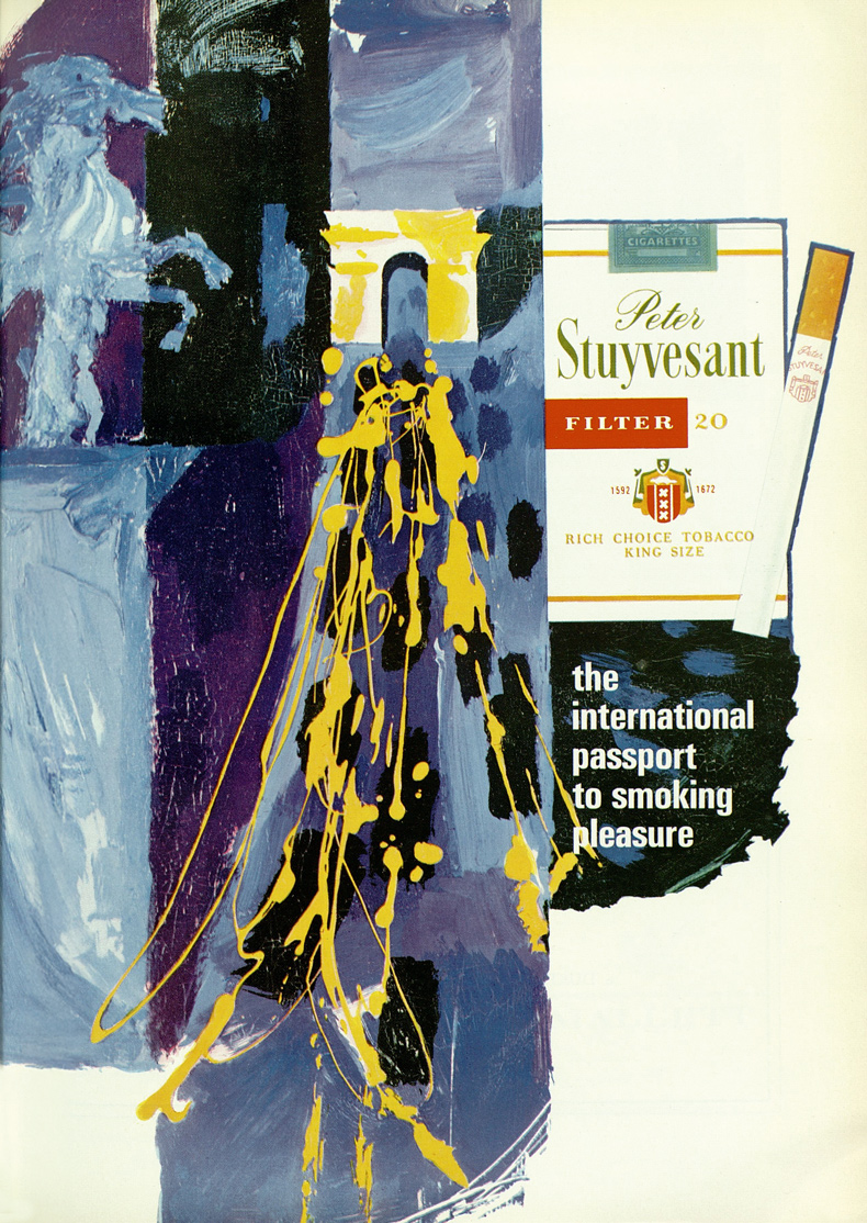
Other campaigns, too, seem tailored to tap into the artistic temperaments of Apollo readers. Swissair endeavoured ‘to remind you of some acquaintances in Europe who would enjoy your visit’ – a series of faces cropped from works by Cézanne, Gros, Caravaggio et al. in various galleries from Málaga to Moscow. Similarly jet-setting, Peter Stuyvesant cigarettes (‘The International Passport to Smoking Pleasure’) ran with a rather garish full-page painting in purple and sky-blue, an abstracted view of what is presumably the Champs-Elysées – the lights of the main drag are rendered in yellow splotches of oil paint, after Jackson Pollock.
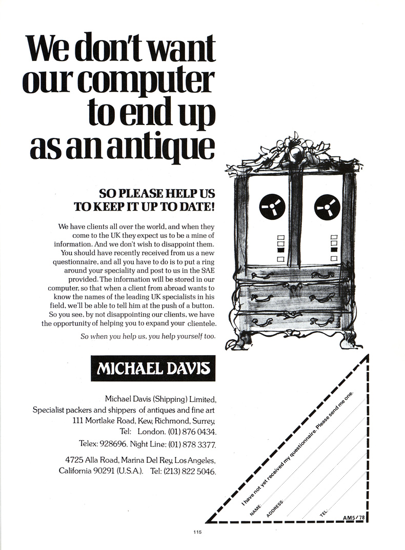
Even advances in technology led to ads being laser-targeted, the antique colliding with the modern. ‘We don’t want our computer to end up as an antique. So please help us keep it up to date!’ wrote Michael Davis (Shipping) Ltd in the late 1970s, accompanied by an endearing sketch of a Chippendale-style cabinet housing a state-of-the-art reel-to-reel mainframe. By 1998, the online Network Gallery was trumpeting its modernity with a yellow @ symbol – that curlicued icon that embodied the ’90s internet – set within a rococo silver frame. Nevertheless, it felt obliged to include telephone and fax numbers. Just in case.
The web has, of course, had a profound effect on the magazine industry and its advertising model; it feels, too, like the natural abode of some of the more, shall we say, esoteric enterprises found in Apollo’s back issues. Take this advertisement from D.M. Klinger of Nürnberg, W. Germany, in 1984: ‘We prepare special auctions of erotic art in Africa, the primitives and South America, erotic watches and automatons, erotic cards and games, erotic postcards, erotic walking sticks’ – you get the point. We will not see its like again.
From the June 2025 issue of Apollo. Preview and subscribe here.