From the April 2024 issue of Apollo. Preview and subscribe here.
London’s BT Tower is a strange phenomenon: a landmark with no location. To be clear, it does have a location, in Fitzrovia on the northern fringe of the West End. It even has an address, on Cleveland Street. But it always seems to be observed at a distance, never from directly beneath. The Fernsehturm in Berlin, completed in 1969, four years after the London tower opened, has a monumental place at the centre of the rebuilt Alexanderplatz. London’s more modest totem to the invisible spectra is only half the height of its Berlin cousin, just enough to peek over north London’s line of hills. It hardly has a base at all. It floats above the city like a Fata Morgana.
The Post Office Tower – from a time when the General Post Office (GP) had a much wider remit over all forms of British communications – was designed by Eric Bedford, chief architect to the Ministry of Public Building and Works. Its original purpose was to provide a signals backbone for the expansion of London’s telephone network and the introduction of colour television. For 15 years it was the tallest building in London, before being surpassed by the NatWest Tower. Today, however, it is largely obsolete, and BT has announced that it will be sold for conversion into a hotel, to be designed by Thomas Heatherwick, the elite’s favourite outsider.
A dramatic insertion in a low-rise city, wearing its high-tech purpose on its sleeve, the BT Tower was an unmistakeable symbol of modernity. It did not historicise. But it was immediately popular, including with John Betjeman, even if he could hardly believe it himself. The design, Betjeman wrote in 1970,
had a stormy passage behind the scenes with the Royal Fine Art Commission, being modified again and again so that, like Wren’s St Paul’s, it completely changed its appearance several times. The result is an improbable triumph for the pragmatism of the committee system: a slender campanile surprisingly similar to one of Wren’s in its disposition, with revolving restaurant in place of belfry.
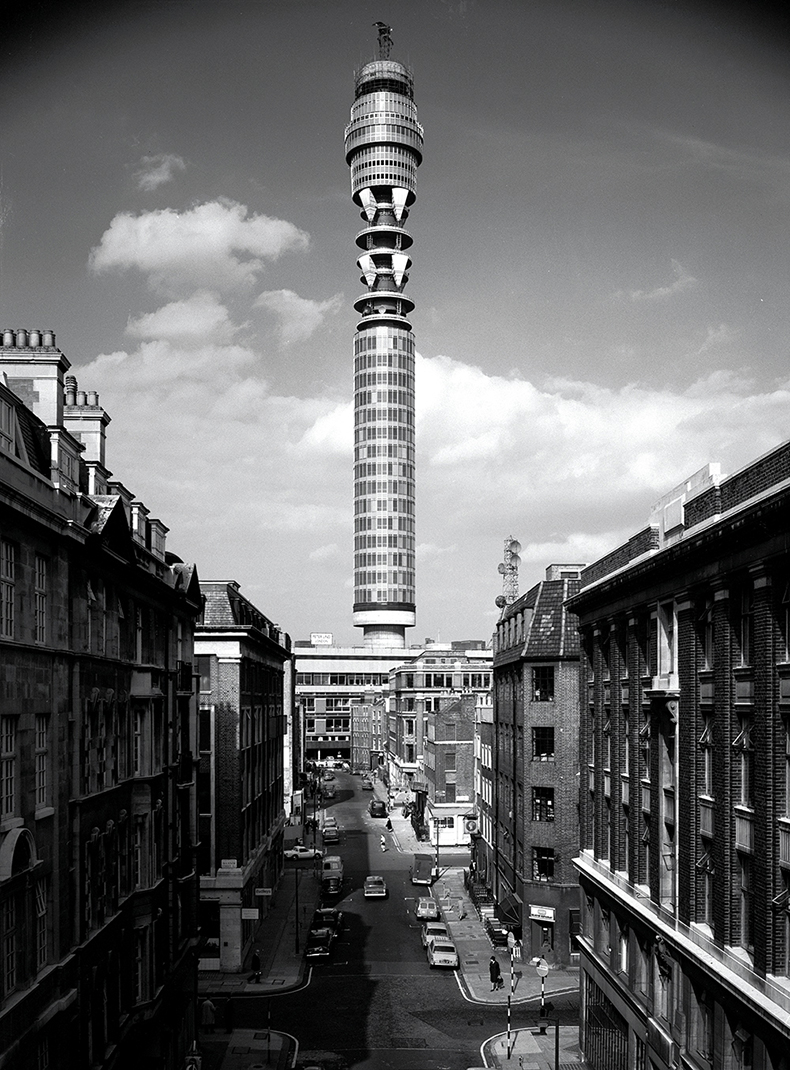
The BT Tower on 60 Cleveland Street, Fitzrovia, London, seen from Clipstone Street. Photo: Henk Snoek/RIBA Collections

Slender, yes, although not as slender as it might have been. A curious feature of the tower, absolutely central to its appearance and to its strange success, is the part that people look at least: the bland stack of floors below the transmitter levels. These are offices, and there’s nothing unusual about that. But if you look at photographs of the tower under construction, you’ll see that these uniform office floors conceal something. At its base, the concrete core of the tower is almost as wide as the visible diameter, and then tapers towards the top. This shape is typical of such towers and provides the stability needed for the clearest possible signal. In other places – such as Stuttgart’s television tower, completed in 1956, apparently a model for the Ministry’s planners – this concrete stalk is left bare, making a much more dramatic landmark. That wouldn’t do in Fitzrovia.
In other words, it is furniture, not sculpture. Its hybrid nature gives it an urbane air, with a twist of frump. The ‘white heat’ was behind a fireguard. Fondness is the vibe, not awe. It was immediately at home in a capital that simply cannot do the Grand Manner. Trafalgar and Parliament squares are fudges. The Mall is grand but the city turns its back. Kingsway, London’s answer to the Champs-Elysées, is a muttered excuse. You have to go to Greenwich for spectacle. And we’re better off for it. From its beginning, the tower had a purposeful solidity, an air of permanence. At the end of Maureen Duffy’s strange, history-spanning novel Capital (1975), the remains of the structure protrude from a deserted and overgrown flood plain, and are the only marker of London’s former location.
Popular affection was, sadly, always at a remove. For the greater part of its life, since 1981, the tower has been closed to the public, originally for security reasons (a bomb was once detonated in the toilet of the revolving restaurant). When I was young, this closure was a common cause of regret and embarrassment – part of the general sense, in the later 1980s and early 1990s, that London had something a bit wrong with it, and struggled with things that other cities found quite straightforward. Since then, the city has regained its swagger, and now has a wide selection of viewing platforms, sky gardens and observation wheels. But it was always a pity that this particular building was off limits, and no doubt contributed to that sense of it always being just over there, never here. Now it is almost quaint – a reminder that modern telecommunications, for all their astounding contributions to life, have caused very little in the way of public architecture. Fibre-optic cables are invisible, masts and dishes are distributed and utilitarian, data centres are out of the way and sunk in sullen, paranoid anonymity.
Conversion into a hotel will at least allow a modicum of access, at a price, but it will in no way be a public building. What are the prospects for the scheme? Extraordinarily – reflecting its erstwhile function as workaday infrastructure – the tower is only Grade II listed. But there is no automatic cause for concern. Possibly the most modern aspect of the tower is its adaptability. It is a platform rather than a device, and it has changed appearance quite dramatically more than once in its life. The scrolling LED screens on its uppermost level were a shock when they appeared near the turn of the century, but have since become a familiar feature in keeping with the tower’s landmark futurity. The earliest transmitters mounted on its operational levels were shaped like art deco wall sconces. Later these were replaced with circular microwave dishes. Since 2011 these levels have, rather sadly, been left bare.
A conversion that maintained the spirit of the tower, without pickling it, might follow this plug-in model. The profile could be kept much as it is, with new modules added to the transmitter levels to fill the currently empty space. The modules could even be interchangeable and ever-changing, providing continual gentle variety on the skyline and giving the tower an avant-garde Metabolist edge. We must hope that Heatherwick uses the commission to celebrate the tower, rather than using it to celebrate Heatherwick.
From the April 2024 issue of Apollo. Preview and subscribe here.


