From the December issue of Apollo: preview and subscribe here
The new 17th- and 18th-century European Galleries at the Victoria and Albert Museum open this month. The lead curator Lesley Miller explains the hard decisions involved in making displays.
Why did the European Galleries need to be refurbished? How are the spaces different now?
The galleries were last refurbished in 1972 and in the intervening 40 years they had fallen below the standard you would expect, both curatorially and in terms of access. In the 1970s, they did a big build within the space and brought the ceilings down (some of that was to make space for air conditioning) and blocked out the windows. All of that has been taken out and the windows are back in place so that, in principle, visitors will know where they are in relation to the street outside.
We recognise the importance of the Aston Webb interiors, so we haven’t built any walls obscuring the ceiling or the interior. There are screens instead, so you are always able to see the shell of the 1909 spaces. There’s a sense of loftiness, because the ceilings are high and it feels lighter.
What does ‘Europe’ mean in this context?
LM: We were very keen to make sure that our Europe is a fairly inclusive Europe, that it’s not just Western Europe. The displays try to represent the continent from Portugal in the west to Russia in the east, and from Spain in the south to Sweden in the north. We’re also keen to make clear that this is the beginning of a Europe that is very involved with Africa, Asia and South America, through the building of empires and trade. It’s the first time that you can say that Europe systematically explored, exploited, and collected resources for their design in far-flung parts of the world.
We’ve made a conscious decision not to include Britain, as the museum holds the national collections of British art and design, which have their own newly refurbished spaces – that’s a practical, not a political decision. And when we were looking at Ottoman Europe we decided that, since we have Middle Eastern galleries, we would not be taking objects out of them.
How are the galleries arranged?
We’ve created a chronological story, which is told in four long galleries interspersed with three smaller galleries. The long galleries are the chronology and the smaller galleries provide a more immersive experience on a particular theme or subject. So, for instance, our first gallery sets the scene by looking at Europe in the world in 1600–1720. And that’s followed by a small gallery, which focuses on collecting in Europe in that period. That room is called ‘The Cabinet’, to show that it’s a different type of gallery.
We’re trying to create a narrative for 21st-century visitors who may have less knowledge of art history than the people who used the galleries in the 1970s, and who are perhaps interested in different stories. We don’t neglect styles and iconography, but we have displays about baroque and rococo and neoclassicism – and explain what art historians mean by those terms – rather than just assuming that everyone knows.
How did you choose which objects to display out of such a large collection?
We’ve avoided repeating themes as much as possible. Most of our displays are about the arts of living, although we have a few that refer to making and manufacturing. We had to make very difficult decisions about where to put certain things. For instance, the whole collection is very strong in drinking and dining material, but we decided that grand dining would fit into the 18th century. Whereas with global trade, it was very important to put it in the first gallery as a sign of something that was changing in the world at the time.
We asked all the curators with specialisms in this period to come up with their A-list of objects (nearly all of them got in!). Then we looked at how these were distributed in terms of larger objects versus small objects, because obviously the large objects can act as a spine through the displays, and you build around them.
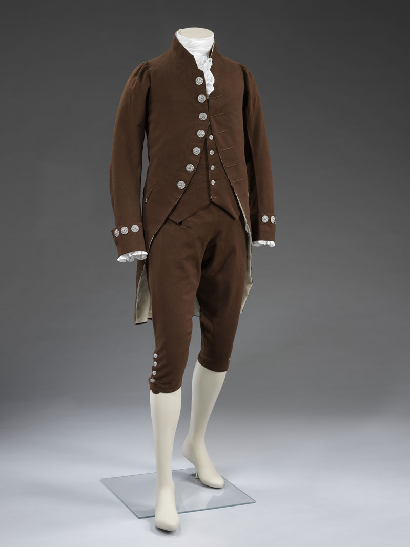
Coat, waistcoat, and breeches liked with silk and linen, with cut steel buttons, c. 1790, France Victoria and Albert Museum, London

Can you describe some of these larger, anchoring objects?
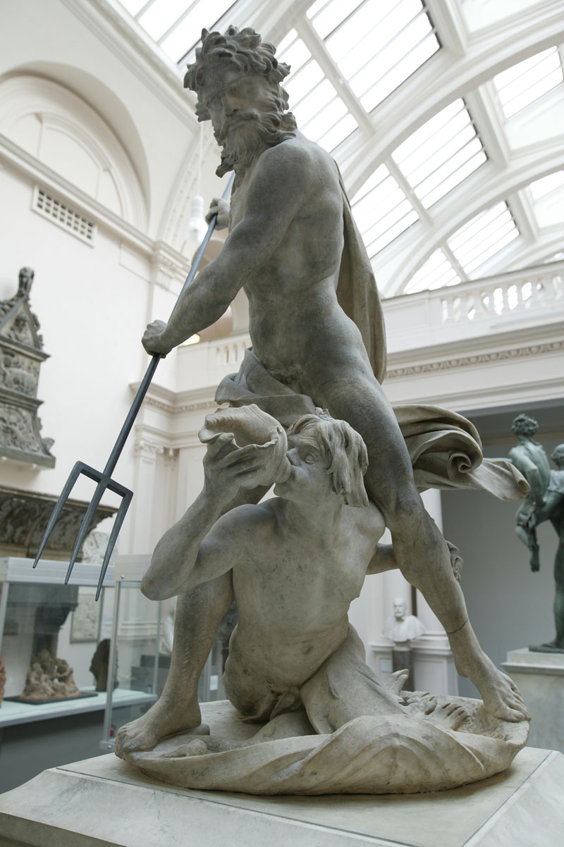
The most obvious object is the one that you find when you enter the galleries: Neptune and Triton. The Bernini sculpture was previously in the sculpture gallery, but as the most important piece of baroque sculpture in the museum it merited a place in these galleries. It sits at the entrance to the galleries, acting as a kind of beckoning mechanism. Another example is in the rococo gallery, where you can find a wonderful Dresden cabinet designed for Frederick Augustus of Saxony.
Could you pick out a favourite object in the displays?
It’s always very difficult. There are the quirky objects…I love the brown woollen suit, which is an incredibly plain suit with cut-steel buttons. It’s typical of the fashions associated with the English taste that swept the end of the 18th century. Such suits do not exist in great numbers, because they’re not glitzy and they haven’t been great collectors’ items. But then I have to balance that with the most stupendous needlepoint hanging of Louis XIV as Jupiter, which is monumental in every way!
The ‘Europe 1600–1815 Galleries’ of the Victoria and Albert Museum, London open on 9 December 2015.


