Perhaps you’ve come into the capital, eager to visit the London Transport Museum and take in a new play about the invention of the Tube map, and your train has terminated at Euston. Take the southbound Bank branch of the Northern line one stop to King’s Cross, change to the Piccadilly line and travel south to Covent Garden. Or take the southbound Charing Cross branch (still the Northern line) to Leicester Square, and walk. It’s only a few minutes, but you wouldn’t know that from the map. If you’re not used to the coloured lines that spread out across the page, the whole Northern line branching system can be difficult to wrap your head around. That’s assuming you can understand the interchanges at Euston and King’s Cross to begin with; if you find that confusing, don’t even look at Liverpool Street – or is it Moorgate?
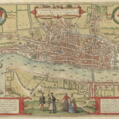
One hundred years ago, the map was quite different. But the underground train journey from Euston to the building that now houses the London Transport Museum (a flower market in 1924) was much the same. On that map, the Bank branch is called the City & South London Railway and stretches from Euston in the north down to Clapham Common in the south. This was London’s first deep-level Tube line and opened in 1890 with electric trains. The Charing Cross branch of the present-day Northern line was known as the Hampstead & Highgate Line. But what has changed most dramatically in the past century is the guiding principle of the map. A hundred years ago, the lines were organic – coloured strokes overlaid on a simplified map of London, complete with patterned green parks and a geographically accurate river. It was topographical and easy to understand, but at a significant cost: only the centre of London was shown.
As the underground railways expanded, farmland became suburbs became city. Cutting off the map at Camden, Shoreditch, Stockwell and Shepherd’s Bush rendered it useless for anything except journeys into the city’s centre. The Underground Electric Railways Company of London (UERL), a precursor to London Underground, tried several fixes. In 1925, draughtsman Fred H. Stingemore eliminated geographical detail, including the Thames, which allowed him to truncate the lines. But east- and west-bound trains still extended beyond the map’s boundaries, and with the streets, parks and bodies of water gone, the sinuous lines made little sense. The following year, the Thames was back. Yet the tangle of multicoloured curves is neither intuitive as a route planner nor useful as a geographical tool. It looks more like the intimidating mess of electrical wiring film directors sometimes show in a ticking bomb.
The connection between electrical systems and the Tube map is not entirely coincidental. The Truth About Harry Beck, a Natural Theatre Company production directed by Andy Burden and mounted at the London Transport Museum’s Cube Theatre, makes this very clear. Henry ‘Harry’ C. Beck’s first role for the UERL was an apprenticeship in the Signal Engineer’s Office. In this position, from 1925, he drew circuit diagrams and track layouts – when you look at today’s Tube map with a circuit diagram in mind, the similarity is clear. He was a temporary employee, and throughout the latter half of the decade was dismissed and rehired several times – it was during these periods of joblessness that Beck began to fiddle around with the London Underground map. He first designed the Tube diagram that would revolutionise transit system representations around the world in 1931; in 1933, the Underground introduced the topological map to the public. We still use a version of it today.
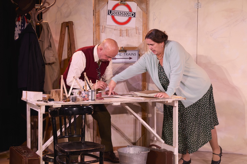
Simon Snashall as Harry Beck and Ashley Christmas as Nora Beck in The Truth About Harry Beck (2024), written and directed by Andy Burden at the Cubic Theatre, London Transport Museum. Photo: © Mark Douet
Under the aegis of Frank Pick the UERL had already developed a distinct and unifying visual identity. In 1913, he had commissioned the father of modern calligraphy, Edward Johnston, to design a sans-serif typeface. The result, Johnston Sans, is still the official font of Transport for London. In the 1920s, Pick tasked architect Charles Holden with designing the new Northern line stations south of the river. Once it was possible to travel between Edgware and Morden, the UERL set about promoting the ends of the line. Pick was following the Field of Dreams principle – ‘if you build it, they will come’ – with one important caveat: you have to advertise it, too. Beck was one of those creating the advertisements. In the play, Beck (Simon Snashall) takes his wife-to-be Nora (Ashley Christmas) on a Valentine’s Day stroll to Finchley Central station to see his latest poster, a clean, deft landscape that displays the ‘graphic grace’ for which the UERL became known. The contrast between the poster and the old Underground map is striking; as the play tells it, Beck’s inspiration for redesigning the Tube diagram (not map; it isn’t geographically accurate) is that, visually, the existing version was a stain on London Transport’s otherwise modern identity.
Once Beck gets stuck on ‘the diagram’ he thinks of little else. Poor Nora puts up with a workaholic partner who sees only grids and coloured lines – even when doctors tell her she won’t have children, even when her mother is dying. Christmas, like Nora when it came to domestic labour, does a lot of heavy lifting; she plays a whole host of other characters with panache, including a brusque Mr Pick. Snashall is convincing as the one-track-minded Beck, and the moments of tenderness between the couple elevate the play from simply educational to touching. Although ostensibly a production about Beck’s invention and the resistance he faced, The Truth About Harry Beck is also a domestic drama. Sue Condie’s design subtly highlights this aspect – the whole play takes place in the Becks’ New Forest living room, with posters and signage hung on the backdrop indicating other locations. There’s a particularly clever bit of stagecraft involving coloured ribbons attaching to a hat stand, a floor lamp and a woman in the front row who temporarily becomes Kennington.
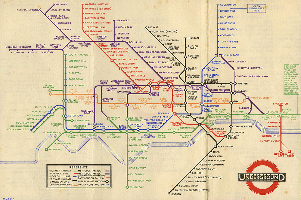
The first pocket edition of Harry Beck’s Underground map, released in January 1933. © TfL/London Transport Museum
Beck’s design eschewed all geographic accuracy, replacing the cambers and curves of the previous map with straight lines running vertically, horizontally and at 45-degree angles. Lines turn around gently sloping corners; stations are indicated with ticks or diamonds where there is an interchange; the centre of London is expanded to make room for clustered stations and the outer reaches of the network compressed so that almost all stations (east of Mile End on the District line is still relegated to a list in a box) are represented. Station names are printed in Johnston Sans, and every care has been taken so that no corner of the network appears cramped or confusing. It is as if someone has taken that mess of wires and pinned them to a board in a neat, regular pattern. It is a work of art. And yet, when Beck first presented his design to the UERL publicity department in 1931, he was told it was ‘too revolutionary for public use’.
A year later, Beck tried again. His timing was right. Herbert Morrison, Transport Minister in the short-lived Labour government, had introduced the London Passenger Transport Act in 1931; in 1933, the bill was enacted, and London Transport took over the UERL as well as a handful of other private companies. Frank Pick became the vice-chairman of the new enterprise and immediately set about standardising branding across the board. Official material should communicate the network’s safety, efficiency and ease of use. Beck’s diagram was streamlined and standardised; it portrays London as orderly, clean and fully within government control. Pick was convinced. London Transport released a limited trial run of Beck’s diagram in 1933. ‘A new design for an old map’ proclaimed the front cover of the folded pocket diagram. ‘We should welcome your comments.’ Any feedback was surely good, as the map went into a second printing almost immediately.
Harry Beck in 1968. © Ken Garland Estate
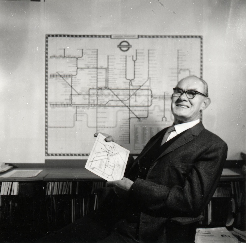
For the next two-and-a-half decades, Beck would continue to update the diagram. But this was all an unpaid side project. He was paid just 10 guineas for the initial design, and never compensated for any of the many updates that came after. By 1958, London Transport’s demands of Beck seemed to have stopped, but he kept going. In 1960, the organisation served him the ultimate slap in the face. A ‘usurper’ named Harold F. Hutchinson had taken all that was elegant and considered about Beck’s diagram and tossed it on the train tracks. Gone were those sloping corners, replaced by harsh, pointed angles. The area around Liverpool Street became a mess, with Aldgate squeezed in so tightly that ‘Ald’ sat on the left of the line and ‘gate’ on its right. Beck saw the new map – more geographically accurate but less pleasant to look at and harder to understand – at his local station. Snashall’s portrayal of his reaction is nothing short of heartbreaking.
Beck never really recovered. When he died 14 years later, he was still not recognised as the inventor of the Tube diagram. Now, with a biographical play and his name on every Tube map published by TfL, he is getting some of the credit he deserves. Beck’s diagram has inspired amateur cartographers and professional designers alike; its innovation has influenced transit maps around the world. In 2013, 80 years after his diagram first landed in the hands of grateful Underground passengers, English Heritage unveiled a blue plaque on a terraced house in Leytonstone: ‘Harry Beck 1902–1974 Designer of the London Underground map was born here.’ It is printed in a font familiar to anyone who has taken the Tube: Johnston Sans.
The Truth About Harry Beck is at the Cubic Theatre, London Transport Museum, until 5 January 2025.