By the mid 16th century two grand Islamic empires had been at war for 20 years. That of the Persian Safavids, led by Shah Tahmasp, was defending its territory from the Ottoman sultan Suleiman the Magnificent. Though this was principally a battle over land, its politics were inevitably coloured by religious rivalry. Suleiman saw himself as the defender of Sunni Islam, while Tahmasp wanted to uphold the Shia faith. But when all was said and done, both men were Muslim; upon Suleiman’s death in 1566, 11 years after the Amasya peace treaty, Tahmasp sent gifts to the new sultan. Among the 34 camel-loads of riches were some extraordinarily beautiful Qur’ans. The holy book was a unifying symbol, of course, but the lavish attention paid to its designs sent another message: the Shia were just as Muslim as the Sunnis, and would honour the word of God, Persian-style.
Although we cannot be certain, Elaine Wright speculates that the magnificent Chester Beatty Ruzbihan Qur’an was in one of the shah’s camel bags bound for Constantinople [in Lapis and Gold: Exploring Chester Beatty’s Ruzbihan Qur’an; Chester Beatty Library, in association with Ad Ilissum]. It was one of the finest Qur’ans – if not the finest – made in the 16th century. We know nothing about who commissioned it other than that they were extremely rich, but we do know it likely originated in Shiraz sometime in the 1550s. The calligrapher, who fortunately signed his name on the manuscript, was Ruzbihan Muhammad al-Tab‘i al-Shirazi and it was his genius – aided by the superb skill of the anonymous illustrators – that created this astonishing work.

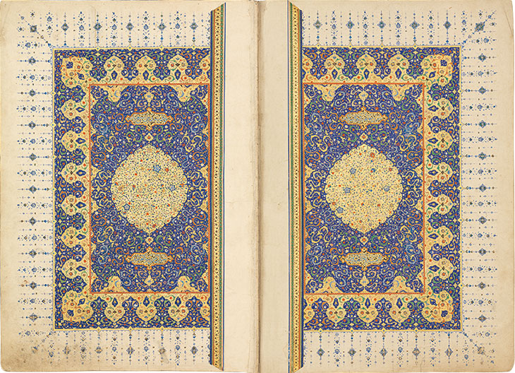
Frontispiece of the Ruzbihan Qur’an. Chester Beatty Library, Dublin
Certainly the American collector Chester Beatty was impressed. He or his daughter probably purchased the Qur’an in the late 1920s from an Istanbul book dealer. A note on the flyleaf says that it belonged to the Russian ambassador to the Sublime Porte and before then was in the Ottoman Royal Treasury. In the 1950s, Beatty brought it to his new library in Dublin. At 890 pages, and just over 40cm tall, this is a book that must surely have been read only on important ceremonial occasions. Unfortunately a pale-green pigment containing copper, used to decorate the borders, has burned through the pages over the centuries, causing them to stick together. Wright, who worked at the Chester Beatty Library for almost 20 years, explains that this is why in 2012 the decision was made to separate the leaves from their binding. Four years later thousands flocked to an exhibition at the library where more than 50 folios were displayed. This book was meant to be the exhibition catalogue but took too long to complete.
You can understand why Wright had to take her time. Here she examines every aspect of the calligraphy and design meticulously. No flick of an alif or curve of an ‘ayn goes unnoticed; no variety of lotus goes unremarked. Her attention to detail mirrors Ruzbihan’s own fastidiousness. This makes her account rather heavy-going to read straight through: no doubt it is aimed at specialists. But such is the quality of the reproductions and the precision of the analysis that anyone with an interest in the subject will find something to draw them in.

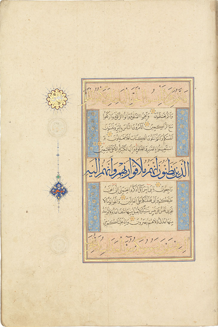
Page from the Ruzbihan Qur’an (mid 16th century), Ruzbihan Muhammad al-Tab‘i al-Shirazi. Chester Beatty Library, Dublin
A typical page of the Qur’an is divided into five bands and three calligraphic styles: the larger top and bottom panels are in muhaqqaq, a monumental, clear and even script; the middle panel, of equal size, is in thulth, the more elaborate curvilinear style usually found on mosques; the smaller second and fourth panels are in naskh, a highly legible and well-balanced script that is closest to ordinary handwriting. The panels with the larger script were first sprinkled with pink and/or gold pigment before being written on. Along the edges of the naskh script are richly coloured floral designs. The whole effect is somewhat architectural, as though the page were built of solid blocks of stone – adding to its awe-inspiring effect.
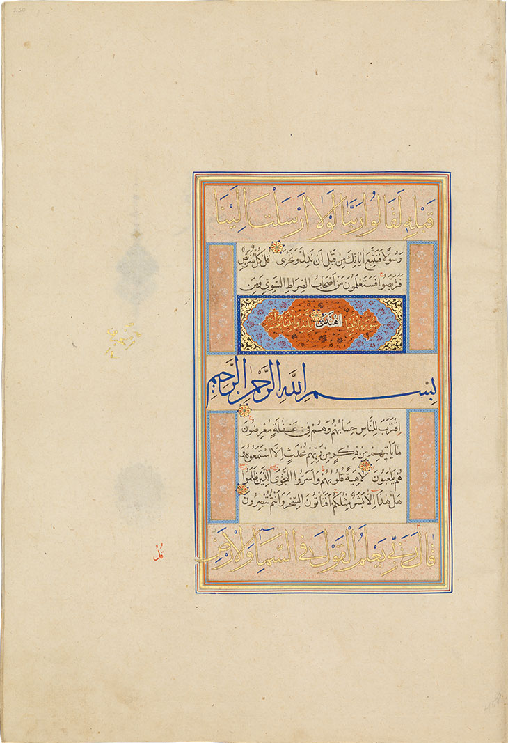
Copying out the entire Qur’an, which consists of around 6,000 verses, must have taken immense patience. And since the beige paper had already been carefully prepared there was little room for error – literally. We see Ruzbihan at his most ingenious when he misjudges the length of a verse and needs to somehow fit the rest in. At the end of sura (chapter) 20 of this Qur’an, the Prophet is told by God to say to the disbelievers: ‘You will know who will be the companions of the even path and who of…’ There the sura ends. The final word, ‘the rightly guided’ or Ihtada, appears in the heading decoration of the following sura in a floating white cloud – as though the word, like the rightly guided, were already drifting heavenward. To squeeze in the word al-kitab or book, Ruzbihan cleverly uses the cap of the letter kaf to form the boat of the ba. (To follow most of this you really need to be able to read Arabic.) Elsewhere, when he really messes up, he licks the letters off the page and starts again.

Page from the Ruzbihan Qur’an, with the final words of sura 20 written in the space for the heading for sura 21. Chester Beatty Library, Dublin
Some readers will have limited patience with such microscopic orthography, and might enjoy more the many types of blossom Wright catalogues. The Qur’an’s opening exordium, sura al-Fatiha, is placed within two pear-drop medallions with lotuses and rosettes swirling round arabesque vines. The text is written in white and is very hard to read, but that doesn’t matter, since every Muslim knows the words already: the artists therefore had the freedom to run riot in precious ultramarine and gold. One imagines they were inspired by the lush visions of heaven as described in the Qur’an. Or indeed what God describes in sura 16, ‘The Bee’, as the fruits and palms that he has provided for mankind right here: ‘And he has multiplied for you many multi-coloured things upon the Earth.’ Through this work Ruzbihan and his team, in their devoted artistic achievement, offer us just such a glimpse of heaven.
Lapis and Gold: Exploring Chester Beatty’s Ruzbihan Qur’an by Elaine Wright is published by Chester Beatty Library, in association with Ad Ilissum.
From the July/August issue of Apollo. Preview and subscribe here.


![Masterpiece [Re]discovery 2022. Photo: Ben Fisher Photography, courtesy of Masterpiece London](http://zephr.apollo-magazine.com/wp-content/uploads/2022/07/MPL2022_4263.jpg)
‘Like landscape, his objects seem to breathe’: Gordon Baldwin (1932–2025)