The bicentenary of Herman Melville’s birth, which falls this year, provides an opportunity for thinking about how artists have responded to his most famous novel. Moby-Dick (1851), in which Ishmael, the narrator, joins the monomaniacal Captain Ahab aboard the Pequod in a doomed quest to vanquish the titular whale, has given rise to numerous visual interpretations, with illustrators and painters drawn to the novel’s mix of nautical derring-do and philosophical profundity. The novel’s principal characters, and even objects – Ahab, Ishmael, Ishmael’s shipmate Queequeg, from the ‘South Seas’, the whale himself, the coffin on which Ishmael drifts to safety at the end of the novel – have all floated free of their original context and become cultural touchstones.
Rockwell Kent’s line drawings, for instance, originally available as illustrations in the exclusive and expensive Lakeside edition (1930), were quickly republished in a trade edition and then transferred to the more demotic medium of commemorative dinnerware by Vernon Kilns. Also in the 1930s, the Socony-Vacuum Oil Company used an illustration of ‘Moby Dick’s Last Stand’ to advertise its services, while some time later Mohawk Paper Mills produced a set of lithographs, ‘A Classic Creation: The Moby Dick Collection by Barron Storey on Mohawk Vellum’, to promote a new line of products – presumably with the added implication that Melville’s long novel was the ultimate test of a paper manufacturer’s skills. Today, there are dozens of illustrated editions, comic-book and film adaptations, and even a children’s board book (Moby-Dick: An Ocean Primer) designed to introduce young readers to essential maritime terminology such as ‘seagull’ and ‘harpoon’. And of course Starbuck, the Pequod’s first mate and Ahab’s chief antagonist, is now, inadvertently, one of the most frequently mentioned figures from literature.
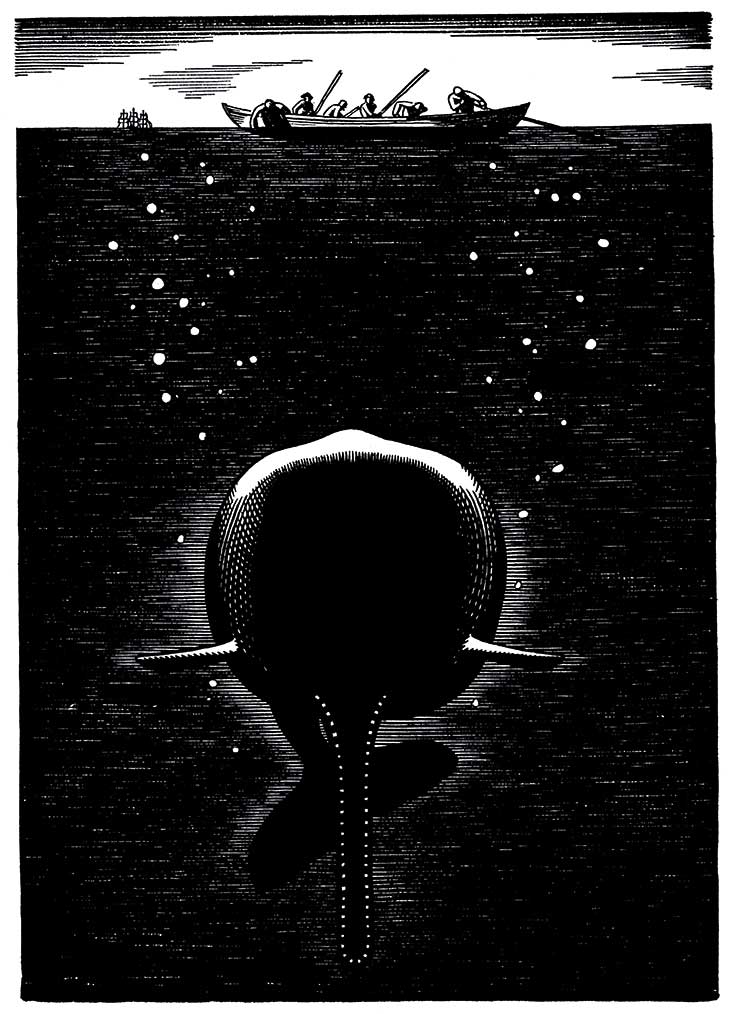
Whale beneath the Sea (1930), Rockwell Kent, illustration for the Lakeside Press edition of Moby-Dick Rights courtesy of Plattsburgh State Art Museum, State University of New York, USA, Rockwell Kent Collection, Bequest of Sally Kent Gorton. All rights reserved
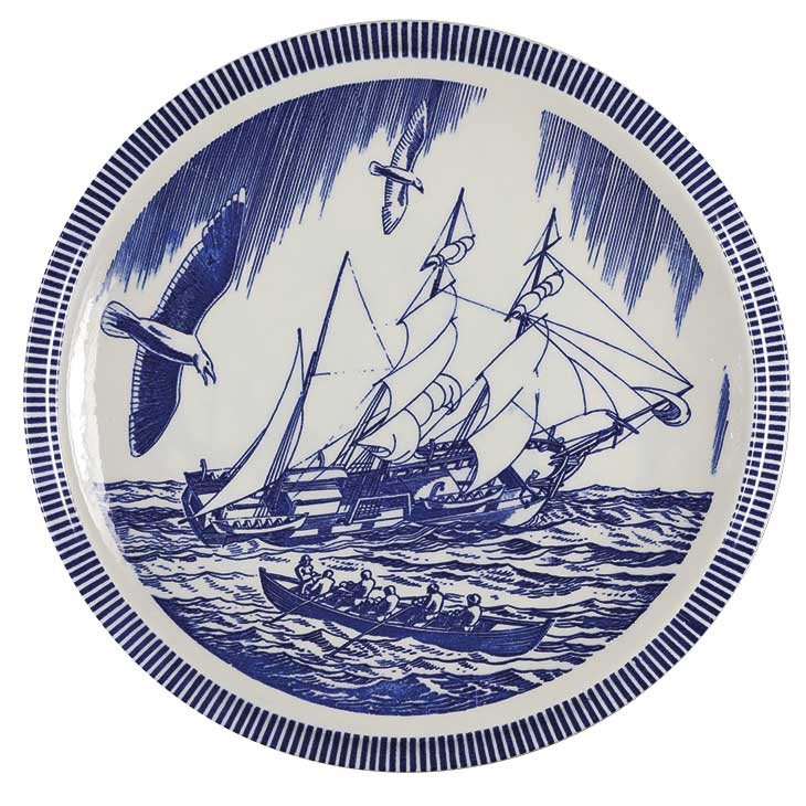
Dinner plate with a scene from Moby-Dick (1930–50), made by Vernon Kilns after a design by Rockwell Kent. Photo: Mark Procknik; courtesy New Bedford Whaling Museum
But while Moby-Dick has often been taken up by artists, it begins with scepticism about images. In the entryway to the Spouter-Inn in New Bedford, Massachusetts, as Ishmael waits to board the Pequod, his eyes settle on a large painting. He is drawn to the work – possibly inspired by J.M.W. Turner’s Whalers (c. 1845; Metropolitan Museum of Art, New York) – though he struggles to say what it depicts: ‘a long, limber, portentous, black mass of something hovering in the centre of the picture over three blue, dim, perpendicular lines floating in a nameless yeast.’ However, its ‘indefinite’ qualities and its ‘half-attained, unimaginable sublimity’ also fascinate him. It is ‘the Black Sea in a midnight gale’, ‘the unnatural combat of the four primal elements’, ‘a Hyperborean winter scene’, ‘the breaking-up of the icebound stream of Time’. ‘Does it not bear a faint resemblance to a gigantic fish?’, he asks. The lure of indefiniteness is, for Ishmael, undeniable even if he can’t entirely give up a contrasting hope: that he might ‘find out what that marvellous painting meant’.
The questions Ishmael asks himself at the Spouter – what the painting means and what it represents, but also more basically which things can be painted and which cannot – are central to Moby-Dick. ‘I shall ere long,’ Ishmael promises midway through the novel, ‘paint to you as well as one can without canvas, something like the true form of the whale as he actually appears to the eye of the whaleman.’ But declaring this objective also allows Ishmael (and Melville) to dwell on the rarity of accurate depictions of whales. Natural historians are, he argues, as incapable of capturing the whale’s appearance as fine artists – to him, the efforts of Frederick Cuvier in his Natural History of Whales (1836) are as lacking in plausibility and precision as those of William Hogarth in Perseus Descending (1729–30). Meanwhile, Ahab’s obsession with the whale relates in part to its status as ‘that one creature in the world which must remain unpainted to the last’. (This phrase provides the title for Elizabeth A. Schultz’s magisterial study of Moby-Dick and modern American art.) Moby-Dick fantasises about the visual image as a potential site of meaning or knowledge, but is at the same time unsure of the explanatory force of pictures; the best artworks that respond to Melville’s text share its interest in these opposed ways of thinking about images.
The first illustrations to Moby-Dick appeared in 1896, five years after Melville’s death and four years after the publication of illustrated editions of his other novels. Both A. Burnham Shute and I.W. Taber, in 1896 and 1899 respectively, produced four illustrations to accompany the text. Each devotes attention to the climactic final hunt, in which the Pequod chases Moby Dick through equatorial waters for three days before it is sunk. But as Schultz has pointed out, the scenes depicted by Shute and Taber could serve as reference points for a number of moments in the text, or indeed any number of 19th-century maritime novels. In this, Shute and Taber set the tone for 20th-century illustrators, including Mead Schaeffer (in 1922), John D. Whiting (in 1928), and the anonymous artist of the 1951 Classics Illustrated edition. The last is typical in depicting Ahab as more or less comparable to the other members of the crew – a little intense, perhaps, but heroically muscular and fundamentally reasonable in his aims. The appeal of Moby-Dick for these illustrators lay in the possibility of recasting it as boys’ adventure fiction, and they emphasised the heroic conventionalism of its characters and events.
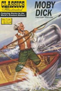
The cover of the 1951 Classics Illustrated edition of Moby-Dick (modern reprint)
Melville, who had little patience for ‘the gasping admirers of Captain Marryatt [sic] & the sea’, might have protested on these grounds alone. But in emphasising Ahab’s heroism, Shute, Taber and the other artists in this tradition also devote little care to the depiction of the whale itself. Shute’s image of Moby Dick throwing a sailor into the air, for instance, gives the whale a strange and indeterminate form. While Moby Dick’s surprisingly slender neck is visible above the waves, his head is invisible, leaving Shute’s knowledge of cetacean anatomy in doubt – an inattention to detail that, with unintentional irony, replicates the errors of perception that the narrator of Moby-Dick makes it his business to address.
The insufficiency of all kinds of knowledge about whales is one of the text’s key themes, and Melville’s best illustrators have also made it theirs. This has sometimes meant a focus on measurement and classification. Barry Moser’s 100 wood engravings for the imposing Arion Press edition of 1979 (which was priced at $1,000, in an edition of 265) take up the classificatory urge of Moby-Dick’s chapters on cetology, for example, providing an illustrated glossary of whaleboats, ship’s gear, marine species and whale anatomy – from prawns to the whale’s penis. Disconnected from the events and characters of the text, these beautiful pictures achieve a kind of abstraction of their own. Running athwart Ishmael’s assertion that ‘there is no earthly way of finding out precisely what the whale really looks like’, they nevertheless demonstrate the limits of precision as a way of developing knowledge of this text’s mysteries: Moser’s illustrations deliberately clarify little about Ishmael’s quirks as a narrator, say, or Ahab’s private, unintelligible obsession with the whale – under the instructions of the press, he was to depict no major scenes or characters, in order to leave the reader to imagine them.

(1979), Barry Moser, illustration for the Arion Press edition of Moby-Dick. © The Arion Press, used by permission of University of California Press
Moser’s illustrations draw on the most famous, and still the most influential, illustrations to Moby-Dick, those by Kent mentioned above. (The Folio Society has an edition in print that uses Kent’s illustrations.) Unlike prior illustrators, Kent devoted considerable attention to the accurate depiction of whales and whaling; his images draw on considerable research, as well as his own experiences roughing it in Newfoundland, in Alaska, in Tierra del Fuego, and – shipwrecked – in Greenland. Kent was drawn to the moments in the novel in which tools of scientific accuracy are tested and found wanting: Emblems, for instance, shows a flower growing out of a heap of globes, books, skeletons and quadrants like the one smashed by Ahab. Kent’s style is also precise: his meticulous drawings in black ink replicate the parallel lines of woodcuts. This technique allows for an array of effects and textures, but images such as the cover of the first volume of the Lakeside Press edition pare back Kent’s style to its iconographic, rectilinear essence.
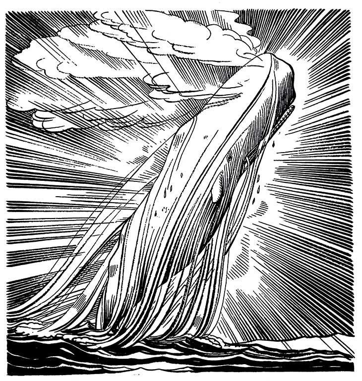
Moby Dick Transcendent (1930), Rockwell Kent, illustration for the Lakeside Press edition of Moby-Dick. Rights courtesy of Plattsburgh State Art Museum, State University of New York, USA, Rockwell Kent Collection, Bequest of Sally Kent Gorton. All rights reserved
Kent maintained that his aim was ‘to transmute pigment into light; and to reduce the bewildering infinitude of nature to an ordered finitude’. But where Moser would later emphasise the ‘bare […] facts’ of whaling, Kent’s images are suspicious of mere surfaces. For him, illustration might accomplish something more mystical and connect what is seemingly unconnected, as suggested by twin images of Moby Dick breaching and Ishmael bobbing free of the wreck of the Pequod on the coffin. Here, the possibilities of Kent’s monochromatic images are most boldly explored – not only for depicting contrast, but for probing its limits as a means of differentiating between physical forms, and of keeping tangible things distinct from their psychological or metaphysical implications. Moby Dick is the ‘White Whale’, after all, and whiteness terrifies Ishmael in part because he begins to see it everywhere, with ‘the white depths of the milky way’ summoning thoughts of ‘the heartless voids and immensities of the universe’. At their best, Kent’s images capture such proliferating connections – between the whiteness of the whale, the whiteness of the stars reflected on the sea in which he floats, and the whiteness of Ishmael’s arm stretching upward. Moby-Dick is a philosophical novel as well as a novel about whaling, and Kent is as invested in the novel’s ideas as he is in the more prosaic aspects of sea life.
Kent is not alone in stressing Melville’s mystical side. Take, for instance, Gilbert Wilson’s Insanity Series (c. 1950), in which Ahab’s head explodes by increments, finally revealing a universe of stars. Or consider Robert Del Tredici’s numerous visual responses to Moby-Dick since the 1960s, which play with the hieratic qualities of Melville’s text, as in the mixed-media print on metallic paper Ubiquitous (2014), recently acquired by the New Bedford Whaling Museum, Massachusetts. Here, Del Tredici captions an image of the phases of the moon, with Moby Dick breaching in between them, with a quotation from the novel about ghostly sightings of the whale ‘in opposite latitudes at one and the same instant of time’.
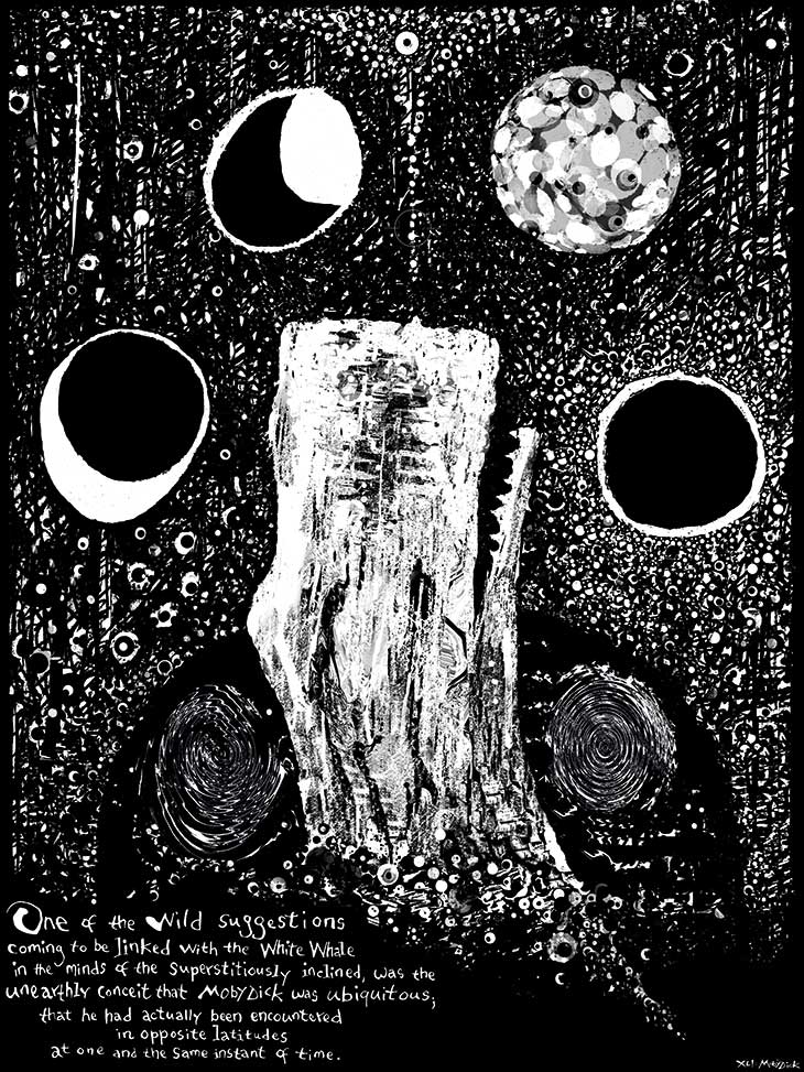
Ubiquitous (2014), Robert Del Tredici. Courtesy New Bedford Whaling Museum; © Robert Del Tredici
Is there a risk, for those artists who are drawn to the novel’s mystical associations, in taking Ahab at his word that ‘all visible objects […] are but as pasteboard masks’ that must be violently penetrated in order to achieve a truer vision? The obstacles to understanding that beset Ishmael are often tangible – and practical. The whale cannot be painted properly, he suggests, simply because it can’t be seen. This is in part because ‘it is a thing eternally impossible for mortal man to hoist him bodily into the air, so as to preserve all his mighty swells and undulations’. But Ishmael also believes that to depict the whale ‘as he actually appears to the eye of the whaleman’ involves more than just the eye: seeing a whale depends on touching it, getting inside it, knowing it inside and out – not abstractly but because, like one member of the Pequod’s crew, you have physically been inside its head harvesting spermaceti. Hence Mark Milloff, in Stripping the Whale (1985), represents the moment when Queequeg pulls this crew member (the Native American Tashtego) from the whale’s head as an explosion of marine creatures, harpoons and blood.
Abstraction and riddles have offered artists another way of taking up this challenge. The visual arts since the start of the 20th century, when Melville was rediscovered, have followed Ishmael in exploring uncertainty alongside the alternate need to explain. Jean-Michel Basquiat’s Untitled (1986), for instance, emphasises the cryptic character of Moby-Dick by incorporating words from the novel into the work’s own sprawling cipher. Taking another approach, a number of artists, especially after Jackson Pollock’s Blue (Moby Dick) (1943), have used the novel to test the relationship between the representational and the figural. Sam Francis’s abstractions such as Moby Dick (1957–58) and Ahab (1962) invite the viewer to consider a resistance to form as appropriate to the chaotic natures of the novel’s central figures. At the same time, the novel’s fascination with dismemberment makes a more literal, gory reading of these pictures possible.
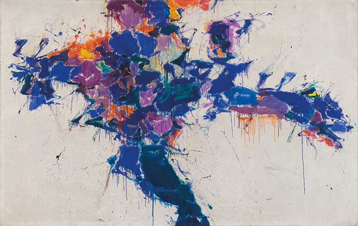
Moby Dick (1957–58), Sam Francis. Photo: © 2019. Digital image, The Museum of Modern Art, New York/Scala, Florence; © Sam Francis Foundation, California/DACS 2019
More recently, Frank Stella’s collection of paintings, lithographs and sculptures inspired by Moby-Dick push abstraction even further, rediscovering Melville’s capacity, in the artist’s words, ‘to bend and curve and deform’. But still, Stella’s luminous, often primary colours, the fluency of his cut-outs and collages, and the promise of straightforward representation made by titling works after chapters of the novel – The Pequod Meets the Rachel (1988), The Shark Massacre (1988), The Candles (1992) – encourage the viewer to hope that these enigmatic artworks might also function as explanations, if only for a moment. In the pursuit of a visual idiom that befits Melville’s novel, perhaps – as Ishmael puts it – ‘a careful disorderliness is the true method’.
From the July/August 2019 issue of Apollo. Preview and subscribe here.


![Masterpiece [Re]discovery 2022. Photo: Ben Fisher Photography, courtesy of Masterpiece London](http://zephr.apollo-magazine.com/wp-content/uploads/2022/07/MPL2022_4263.jpg)
‘Like landscape, his objects seem to breathe’: Gordon Baldwin (1932–2025)