In late imperial Rome, the palatial Baths of Caracalla were graced by a marble figure – now known as the Farnese Hercules – that towered over the real, somewhat feebler, nude bodies of bathers. This three-metre paean to raw brawn has always been a more elusive object than its stolid stature implies. Who, after all, created the famous spectre of a weary demigod? A sculptor’s name, Glykon, is blazoned across the Roman statue, but it has long been viewed as a super-sized copy of a lost Greek original.
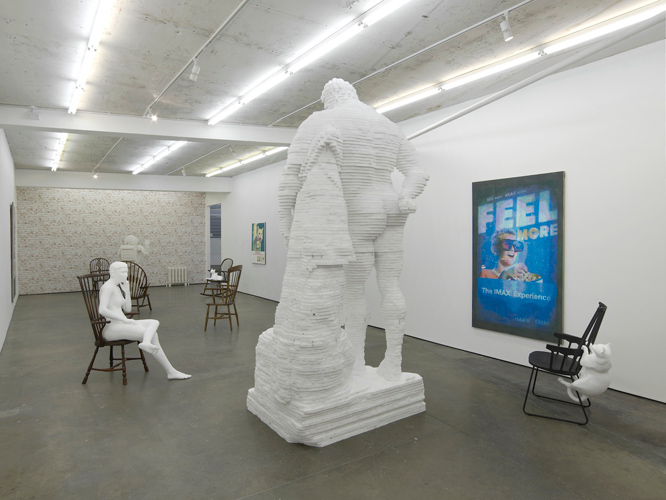
The notion that this heroic ancient statue might also be an overblown caricature seems pertinent to Matthew Darbyshire’s recent recreation of the Farnese Hercules in his exhibition ‘Bureau’ at London’s Herald St gallery. Darbyshire has long been intrigued by the outward packaging of modern life – interior furnishings and surfaces, fixtures and fittings – and the deep meanings we are inclined to ascribe to such ‘stage scenery’. (What, after all, was the Farnese Hercules but a piece of bathhouse eye-candy?) It is therefore apt that Darbyshire’s own Hercules (2014) has been built from polystyrene – the desultory stuff of packaging and padding – in hand-layered seams.
The feather-light effigy stood, at Herald St, amid an array of sculptures including a polystyrene mannequin reclining in a des res Windsor chair, and polystyrene cats scampering around wooden rockers. A series of paintings meanwhile recycled the imagery of vintage advertisements; their air of studied neutrality itself appeared rather ‘vintage’, summoning memories of the appropriation art of the 1980s. From design classics (the Windsor chairs; an Asimo toy robot cast in plaster) to classic advertisements or classical statuary, Darbyshire’s show seemed fixated with that ubiquitous concept of the ‘classic’. Our conversation began with a discussion of the term’s slippery, often contradictory meanings.

Matthew Darbyshire, ‘Bureau’ (2014), installation view at Herald St. Photo courtesy Herald St, London
Matthew Darbyshire: One of my reservations about reinterpreting classical traditions is that while many artists and writers have of course succeeded, so many have also failed. You only have to look at the cringeworthy output of some contemporary artists to realise that it’s best avoided. In fact it’s that misuse that I was trying to refer to with Hercules. All my object selections in ‘Bureau’ are deliberately clichés – they’re trite or obvious in order to become ‘ultimate symbols’ (the Hercules being power, the radiator being necessity, the cats being domesticity, the robot being technology, the cooler being corporate blandness).
This began with a show I did recently in Turin’s GAM museum where I was asked to make work in response to their collection and I found myself identifying within it four sculptural clichés (the phallic in an Arp, the erotic in a Cellini, the abstract in a Merz, and the heraldic in an unauthored lion). These are also, as you put it, very mutable or slippery categories and therefore open to embodying very different meanings.
James Cahill: How did you first come across the Farnese Hercules? What lay behind your decision to ‘translate’ him into polystyrene?
MD: It was in the Royal Academy Schools corridor, where for three years I’d take fag breaks at his feet and admire those thundering thighs! The decision to use polystyrene came through necessity. I wanted to use the same materials as industrial 3D prototyping technologies (in car factories and the like). This was quickly reinforced by the nice element of subversion in a sacred marble form being translated in to the most debased and abundant material known to man. Although it’s grim stuff, it has that pristine whiteness and a reflective shimmer to rival marble’s.
JC: Would you agree that artists have for a long time actively rejected the classical past because of its associations with tradition, academicism, or cultural conservatism?
MD: I was yesterday at the [École des] Beaux-Arts doing a recce for an upcoming project, and was reminded of this point – that there’s nothing particularly radical or subversive in ridiculing the classical. I say this because I found all the students’ tagging and defacement of Venus, Minerva, Bacchus et al, so embarrassing and misguided. I have to say I’m a little wary of this [Nicolas] Bourriaud effect – we saw, with the introduction of graffiti, parkour, and skateboarding, the accelerated the demise of the Palais de Tokyo’s historic architecture, and now it seems to have happened at his new place of residence, the Beaux-Arts. I’m no blustering red-faced Tory, but find this form of protest a bit futile.
I am just as wary of this middle-class, organised anarchy as I am of the conservative connotations of classical plaster-casts. My subversions are of everything – the conventional, the corporate, the classical, the consensual – and are not intended solely as an impotent dig at tradition or academicism.
JC: Do you nonetheless see your current exhibition as part of a recent half-ironic embrace of classical antiquity? (I am thinking, among others, of Jeff Koons, with his exhibition at David Zwirner last year of classical plaster casts adorned with blue baubles).
MD: Not really. Classical antiquity is no more important to me than the contemporary stuff, and in fact, I woke up this morning fantasising far more about making a big cumbersome photocopier than another classical personality. Koons hasn’t been interesting for years. There are one or two artists doing it properly I suppose – Hans-Peter Feldmann’s Davids are irresistibly funny; Oliver Laric’s gobbling up and regurgitation of everything in his path has a certain urgency, and Urs Fischer’s proximity to the dismal output of, say, Quinn, is pretty courageous.
JC: One idea that struck me was that of datedness, or faded power: your Hercules is dated both in its reference to an antique statue, and in its pixelated appearance. The adverts similarly had a belated quality. There was a pervasive sense of objects having been demoted or redeployed: the famous image of Picasso recast as an advert (itself a dated advert), the chairs reused as sculptural apparatus.
MD: I suppose the faded power aspect came about through the juxtaposition of the highbrow or profound form with the low-grade or profane materials (polystyrene and paper to make Hercules and Picasso), and the datedness through my employment of apparently traditional or bygone processes and media (painting, carving and casting). However, I must admit that most of this was driven by a desire, albeit a naïve one, to wrestle back the right to make images and objects from today’s monopolising digital means. In this sense, it could also be construed as empowering.
JC: Does this quality of datedness (or faded idealism) amount to a kind of memento mori, or a commentary on the constant and unavoidable metamorphosis of objects? Is there also a trace of Romanticism (elegising the past) here?
MD: Maybe as a sculptor I find today’s material landscape full of confusion and intimidation. I can’t really fathom the composition of the physical, let alone the virtual, and therefore I possibly lament the lost disciplines I lovingly learned at art school.
However, while wary of the uniformity, genericism, deceit and toxicity of new materials and technologies, I’m becoming more determined than ever to get up to speed. I’m feeling increasingly bored by both our limitations as artists, and this subsequent tendency to elegise, and am even warier of the alleged expertise of our so-called ‘post-internet generation’ who seems only to be reusing materials and technologies as they were intended, as opposed to be taking control or repurposing them in any inventive or meaningful way. Most often, those who want to speak of these issues employ only glib references, via the throwing in of a few scraps of ABS plastic or the guts of an old desktop keyboard. I feel more determined than ever to figure this stuff out.

Matthew Darbyshire, ‘Bureau’ (2014), installation view at Herald St. Photo courtesy Herald St, London
Unlimited access from just $16 every 3 months
Subscribe to get unlimited and exclusive access to the top art stories, interviews and exhibition reviews.


![Masterpiece [Re]discovery 2022. Photo: Ben Fisher Photography, courtesy of Masterpiece London](http://zephr.apollo-magazine.com/wp-content/uploads/2022/07/MPL2022_4263.jpg)
Suzanne Treister’s tarot offers humanity a new toolbox