From the September 2023 issue of Apollo. Preview and subscribe here.
When your child is no longer happy snuggled into a sling on your chest and demands to discover the world on their own, art museums can seem out of bounds, unless there is an interactive, romp-proof Carsten Höller or Olafur Eliasson show in town. Many museums are far more welcoming to children than in the past but there are limits to how accessible such spaces can be, particularly for under tens – spaces that demand visitors navigate them in a slow, orderly manner and where the things you have come to see are often placed above the eyelines of mini humans. Rather than walking around these places in a constant state of high alert, it’s much easier to turn away from art towards more family-friendly museums, ones that combine play and learning: the Science Museum or the Postal Museum in London; the Museum of Making in Derby.
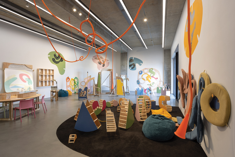
As multi-shaped pastel-coloured cushions with holes in them were slotted on to each of my limbs and I disappeared in to a giant squidgy rainbow-hued sculpture, I wondered what an art museum designed and curated for children might be like. My five-year-old son and I were at the Towner Eastbourne in March. It was our first time at an art museum since he developed the ability to say ‘this is boring’. We were taking refuge from a blustery, cold Sunday in an exhibition of interactive artworks – aimed at children and the inner child in grown-ups – by Leap Then Look (the artist duo Lucy Cran and Bill Leslie). ‘Can playing help you discover new ways of making and encountering art?’ asked the blurb on one wall, but the five-year-old was too interested in what was in the gallery to pay any attention. Around us were large plywood structures to make sculptures out of, tubes that carried our voices to the opposite side of the gallery, cellophane collages that could be assembled and projected on the wall, and more.
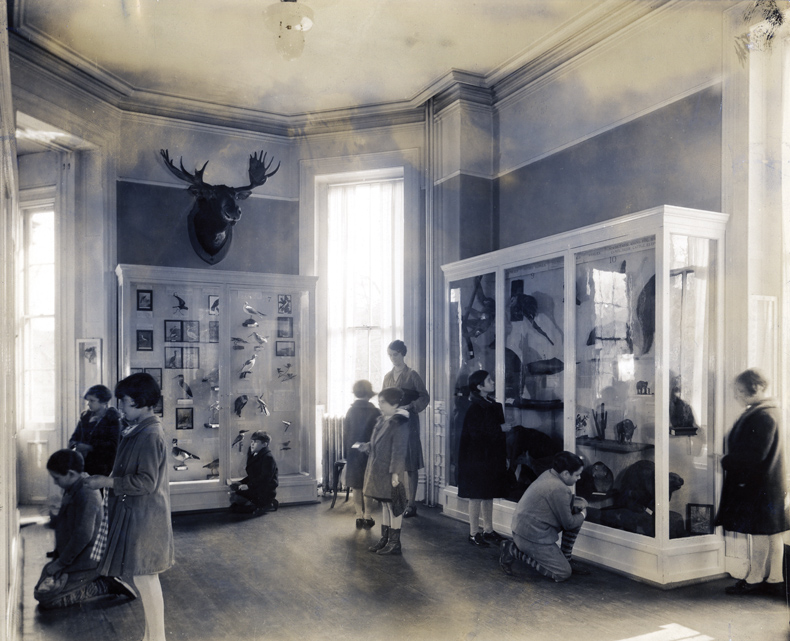
The idea of making children feel at home in a museum is not new. A writer in the New York Times in 1942 was amazed to witness children actually running the Brooklyn Children’s Museum, having keys to the display cases, showing younger children around and answering questions, a practice that reportedly dated back to the museum’s opening in 1899. Now, children’s museums can be found throughout the world – from the Musée des Enfants in Brussels to Mexico City’s Papalote Museo del Niño – with the same aspirations as the pioneering Brooklyn museum: to foster a sense of curiosity and creativity in children through sensory and interdisciplinary learning.

Schoolchildren visiting the Brooklyn Children’s Museum in the early 20th century. Courtesy Brooklyn’s Children Museum
There is a big difference between such child-centric institutions and the fustier museums of childhood that appeared in the post-war period – essentially collections of toys and children’s memorabilia that aimed to show the social history of childhood, along with giving parents a dose of nostalgia. Whereas ‘children’s museum’ suggests their ownership, ‘museum of childhood’ implies a mode of reflection, a distance that only adults, looking back on their younger selves, can possess and, by implication, curate.
What used to be the Museum of Childhood in Bethnal Green has just been revamped and rebranded as Young V&A, and now aligns itself emphatically with ‘children’s museum’. Twenty-two thousand people, mostly children, were engaged in the remodelling. Chief curator Alex Newson tells me what makes the museum unique: ‘We looked at children’s museums around the world but found very few examples who put collections at the centre of the experience […] We were quite conscious that for a lot of our visitors, it might be the first time they’ve been to a museum and actually part of what we wanted to do was to help people learn how to use museums and [show] what they can do for people.’
I visit this ‘showcase [for] the transformative power of creativity’, as Young V&A calls itself, early on a Sunday morning, before a queue starts to snake around the building. Inside the imposing Victorian building – which dates from 1872, though it was not designated a museum of childhood until 1974 – the bright white central hall offers a dramatic white-cube style welcome (and, of course, an extensive cafe). The imposing iron-framed balconies on both sides have been remodelled as open-plan galleries with decidedly more toy-shop vibes, their super-sized signs looming over the visitor in bright colours: Design, Play and Imagine.
Each gallery area caters loosely to a different age group, from birth to 14 years old, but all contain a mixture of cased objects and activities anyone can participate in – from drawing self-portraits to a huge collaborative marble run. (The exception is the Play area for under-fives only: my son and I looked longingly into the colourful, textured space, where objects are displayed at crawl-height). A quieter carpeted gallery in the Imagine area proved the greatest success as, without the inhibiting din and crowds of the other galleries, he peered into doll’s houses displayed en masse as a city and to my delight even pointed out objects behind glass – an early model of the Millennium Falcon in Star Wars was naturally going to get his attention, but a tennis ball-sized microcosm of an imaginary world was a more surprising hit –‘How can we make that?’ he asked.
It was important, Alex Newson tells me, to strike the right balance with the 2,000 objects from the V&A’s collection of art, design and performance. They date from 2,300 BC to the present. Some are familiar and relatable for children today. Others will inspire a degree of nostalgia in parents. And there are also discoveries for everyone – from Archigram’s wondrous design for a Walking City (on a wall near a Minecraft display) to Gérard Rigot’s animal-inspired children’s furniture.
To research how children engage, or don’t, with objects on display, some children were sent out into galleries with GoPro cameras strapped to their heads. Grouping pieces by colour and texture turned out to be especially important for getting the attention of younger children. Some of the artworks chosen – such as a David Hockney painting of raindrops – qualified not because of the stature of the artist but because they illustrated a sound that children could be enticed to imagine.
Young V&A raises key questions about the lengths to which a museum should go to engage its audiences. Is interactivity a spur to creativity or can it be the museum equivalent of talking in slow, drawn-out syllables? Leap Then Look’s Lucy Cran and Bill Leslie have also worked with Young V&A: at a festival there recently they could be found giving anyone who wanted it a ball of string, translating a room into a constantly evolving collaborative web-cum-art piece. Leslie describes to me how three-year-olds were enthralled by the task of unwinding and entangling lengths of string, while eight-year-olds made far more complex structures.
Where it is allowed, Crab and Leslie’s practice makes play the focus. They tell me how refreshing it was for their work at the Towner to be called an exhibition. ‘We’re always having conversations about who the main gallery spaces are for,’ Cran says. Up to this point, the duo, who have been collaborating since 2019, have usually been employed by schools and the education departments of museums, working with groups of children in project rooms outside the main exhibition spaces and unseen by regular museum visitors.
The Towner exhibition was created in consultation with four different community groups: teenagers with special educational needs and disabilities, children in foster care, adults attending a mental health support arts class, and a primary school. Working with many people, who were often at the margins of society, ensured that in ‘designing a space for them, we would kind of automatically design a space that was accessible to everyone else as well,’ says Leslie.

Installation view of ‘Leap then Look: Play Interact Explore’ at Towner Eastbourne in 2023. Photo: Rob Harris
The base materials they work with are hum-drum rather than fancy items, and they rarely buy anything from an art shop. When devising the objects for the Towner exhibition, it was vital to create experiences that allowed for ‘different possibilities’. The greatest reward for Cran and Leslie is to see people interacting with the exhibition in ways they hadn’t thought of: ‘There is no defined way how this space should be used.’
From rethinking the role of gallery assistants (who are discouraged from policing the space with strict rules) to taking a different approach to risk assessment (and persuading insurance companies to take the same view), making exhibitions in this manner means disrupting the ways museums normally operate ‘[Our work] sits within a conceptual tradition, in that the art is happening in and amongst those objects at a particular time in a particular space.’ Both Cran and Leslie come from a theatre background and see their work within the tradition of performance art. Their ‘Play Interact Explore’ exhibition at the Towner will now tour – although, Leslie stresses, it will be redesigned for each space. As they work with more art museums – including, this summer, the National Gallery – hopefully more of them will take note that greater interactivity and accessibility is worth the extra investment.
It will be interesting too to see the impact of the arrival of Young V&A. Will other art museums look to it as a blueprint for how to engage their youngest audiences? Certainly, given the downgrading of the arts in the national curriculum in recent years, that engagement has never been more necessary. (Cran and Leslie tell me that they have heard of teachers who used to go to museum-led workshops and plan a term’s worth of art lessons from them. Now their research is just being channelled into after-school art clubs.) While Newson agrees that many art museums could make more of an effort, he is, perhaps surprisingly, keen to point out that children can enjoy more adult-oriented museums too – and he recalls his own formative childhood experience with an abstract painting at the Tate.
Perhaps it is better not to think of children as a separate audience but to embrace a more playful curatorial approach. An exhibition I attended in 2014 has stuck in my mind as an exemplar of accessible and imaginative curating: in ‘Photographs at Play’ at the Morgan Library & Museum in New York, 85 photographs lined the walls with visitors having to guess the visual or conceptual connections between sequential image. ‘Instead of teaching a lesson or making an argument,’ the curator Joel Smith told Apollo at the time, ‘this is a show that asks you to occupy a curator’s role: making sense of what you’re seeing at every step […] the point here is to see with the freshest eyes you can.’ Museums need to remember their roots in the Wunderkammer, the chamber of wonders: the best thing a museum can do is to turn us all into children.
From the September 2023 issue of Apollo. Preview and subscribe here.


![Masterpiece [Re]discovery 2022. Photo: Ben Fisher Photography, courtesy of Masterpiece London](http://zephr.apollo-magazine.com/wp-content/uploads/2022/07/MPL2022_4263.jpg)
Why it’s time to stop rediscovering Eileen Gray