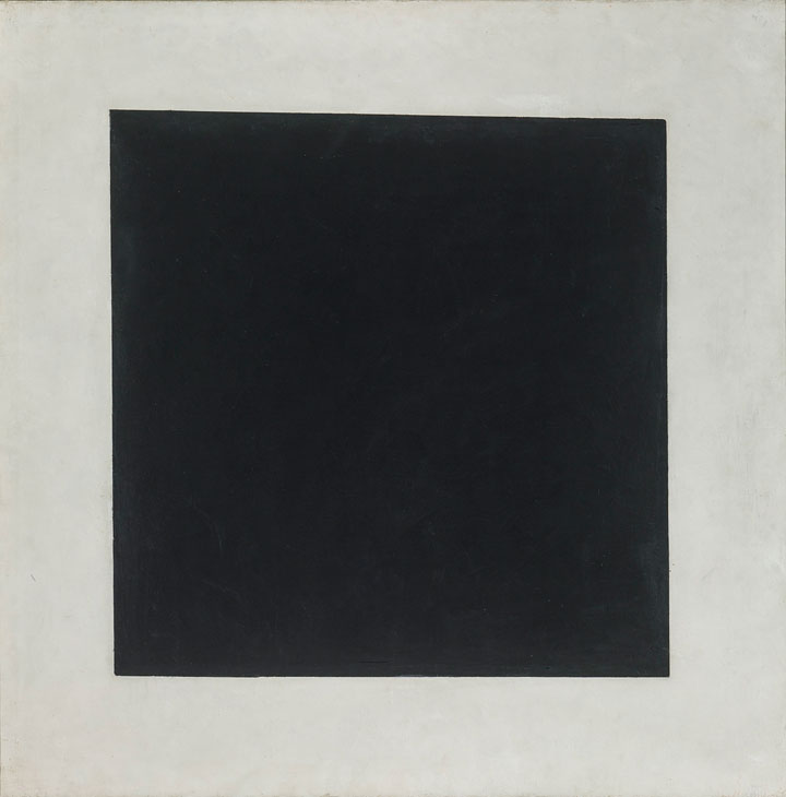
In 1915, Kazimir Malevich produced his legendary Black Square, which he claimed to be ‘the face of the new art’. By reducing his painting to the simple components of black and white, a square and a frame, he ruptured the narrative of colourful Russian figurative art. Yet he was not the first to turn away from a richly-coloured world to focus on blacks and whites, greys or monochromes in order to make his viewers look and think afresh.
This autumn the National Gallery in London stages ‘Monochrome: Painting in Black and White’, an exhibition which considers how and why artists have chosen to paint ‘without colour’ over the years. From intense dark beginnings in the 14th century, the exhibition moves to lighter and brighter rooms focused on 20th-century abstraction, and it concludes with an installation by Olafur Eliasson. Peeps of colour throughout emphasise the radiance of the predominant monochrome. As the curators argue, to trace the history of monochrome painting is also to trace the evolution of the role of painting in Western culture as a whole.

Black Square (1929), Kazimir Malevich. © The State Tretyakov Gallery, Moscow
In the Middle Ages, paintings focused on sacred subjects. Colour in these works symbolised the fundamental change wrought on a shadowy world by the coming of Christ, and was intended to glorify him. Monochrome works, by contrast, focused on the sparse and penitent time of Lent and acted as a foil for works in colour. An altarpiece by Hans Memling from the National Gallery collection makes this beautifully clear. Unusually, it is displayed almost closed, so that the central Virgin and Child peep out, in a sliver of colour, from between the monochrome saints who guard the doors.
The exhibition turns also to secular subjects from later periods, revealing how artists used studies in monochrome to prepare for coloured compositions; the simplified palette allowed them to focus on the fall of light and shade and the balance of forms. French artist Gustave Moreau is the first we meet in the exhibition who liked this aesthetic in its own right; he chose to leave his violent Diomedes devoured by his horses to speak without colour.

Diomedes devoured by his Horses (date unknown), Gustave Moreau. © RMN-Grand Palais / René-Gabriel Ojéda
From the 17th century, both artists and collectors increasingly valued monochrome works for their own merits – for the skill they demonstrated and for their relative affordability. Jan Brueghel the Elder made profitable monochrome copies of his more famous father’s paintings of Netherlandish peasant life, images which also increased the fame of the originals. Jean-Auguste-Dominique Ingres made a careful grisaille version of his own famous Odalisque that both abstracts and simplifies her surroundings and focuses the viewer’s attention on her sensual figure.
Artists also embraced monochrome as a means to rival other media, and the exhibition lingers on how sculpture, print and photography have all challenged artists to imitate and surpass their effects, while also providing important resources. Here the eye is caught by The Introduction of the Cult of Cybele at Rome, where Andrea Mantegna achieves a virtuoso combination of grey stone and red marble effects in a way no sculptor physically could.

The Introduction of the Cult of Cybele at Rome (1505–06), Andrea Mantegna. © The National Gallery, London
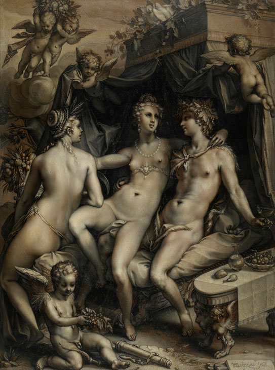
Likewise, the pen paintings of Hendrik Goltzius and Willem van de Velde the Elder hover between painting and drawing. Goltzius, in particular, was famous for his engravings – but despite resembling them, the dense painted images displayed here are too vast for a printing plate. His extremely unusual Without Ceres and Bacchus, Venus would Freeze (1599) towers over you at over two metres tall. Challenging photography, contemporary artist Chuck Close disrupts expectations of both painted and photographic surfaces with his portrait of Joel (1993) which dissolves into a pixelated abstract grid when viewed up close.
Returning to abstraction, Malevich’s painting appears at the centre of a group of works by avant-garde artists who used black and white as an intellectual exercise to focus on texture and form. Ellsworth Kelly’s Black and White Bar I (1970) reveals his attraction to architectural shadows, but also his concern with establishing a composition before adding the emotional values of colour.

Without Ceres and Bacchus, Venus Would Freeze (1599), Hendrik Goltzius. © The Trustees of The British Museum
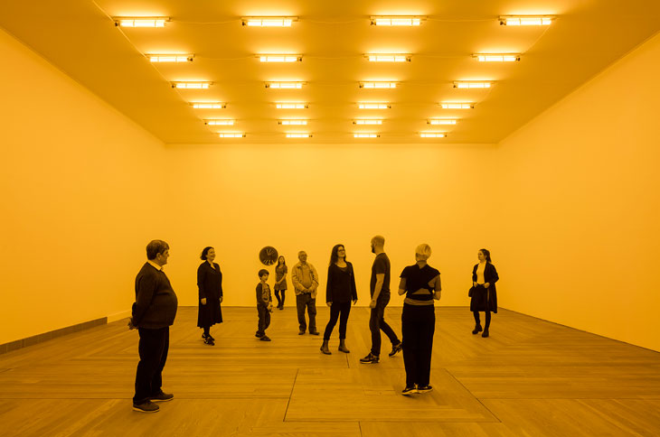
Indeed, throughout this room the visitor is aware of the glowing golden square that forms the doorway into the final gallery, which houses Olafur Eliasson’s installation. Such an unexpected appearance of colour inevitably attracts the eye from the monochrome works. But when you enter this final room, what seemed golden becomes oddly colourless. Eliasson’s use of single frequency sodium yellow light tubes suppresses every other colour in the room so that you see in monochrome. It is an oddly distressing experience to lose your sense of colour nuance in this way.
Throughout, the exhibition returns to the idea that artists are drawn to monochrome as a means of seeing and representing the world differently. By stripping their work of colour, they can focus on narrative, form, trompe l’oeil, technique, or abstracted argument. Of course, there are moments of colour throughout the show, which make the monochrome works all the more alluring and their details and subtlety apparent. To quote Eliasson, you become aware of ‘a sort of hyper-vision that gives us the feeling of having a particularly sharp ability to perceive the space and people around us.’

Room for one colour (1997), Olafur Eliasson. Installation view at Moderna Museet, Stockholm, 2015 Courtesy of the artist; Tanya Bonakdar Gallery, New York; neugerriemschneider, Berlin. © Olafur Eliasson. Photo: Anders Sune Berg
‘Monochrome: Painting in Black and White’ is at the National Gallery, London, until 18 February 2018.


![Masterpiece [Re]discovery 2022. Photo: Ben Fisher Photography, courtesy of Masterpiece London](http://zephr.apollo-magazine.com/wp-content/uploads/2022/07/MPL2022_4263.jpg)
‘Like landscape, his objects seem to breathe’: Gordon Baldwin (1932–2025)