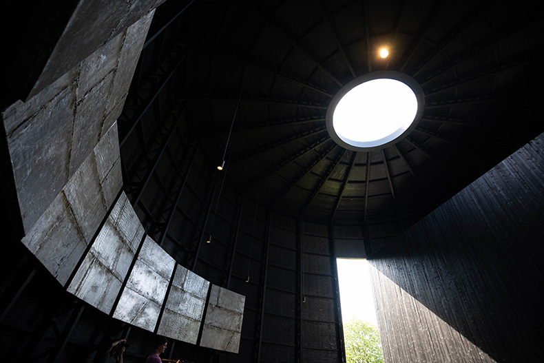
Photography seems unable to convey how big Theaster Gates’ Serpentine Pavilion commission really is. Designed in collaboration with Adjaye Associates and Aecom, the pavilion’s proportions make it seem like a low-lying, squat object, but it is just as lofty as the horse chestnut and lime trees that surround it.
Approaching the pavilion from afar, feeling the coarse surface of the wood under hand and passing through the barn-like doors, it initially appears more agrarian than divine. One might just as likely expect to find a mound of sweet-smelling grain within as a space for solemn introspection.
As it happens, the experience of Black Chapel is as sensory as it is contemplative. The strong scent of timber and oil stain makes the two room pavilion feel very elemental – it is simply composed, of few materials, and each one announces its presence. In an accompanying pamphlet, Gates refers to the Kasubi Tombs in Kampala and Musgum mud huts which have a similarly rudimentary construction approach.
The space also plays with our perception of light and space. The structural frame is made up of timber and steel with slender timber columns circling the interior, connecting into a steel ring beam at the roofline and then meeting at the oculus punched into the roof. Between each of these columns, horizontal structural members serve to add further rigidity. A bench seat fringes the space, following the semicircle between the two large entrances, giving viewers an opportunity to pause and reflect.
From a seated position, the horizontal and vertical lines of the structure seem to rise into the distance, making the viewer feel small and insignificant, which seems to be one of the prerequisites for a powerful, sacred space. Throughout the day a shaft of light penetrates the black void, delighting visitors as they get their moment to bask in the glow of the sun. The timber isn’t homogenous, the knots and grain of the wood remain evident despite the black stain and in-between passing clouds, these illuminated imperfections add texture and depth.

Photo: Harry Richards Photography/reportography.london
On the walls, seven panels (the symbol of completion in biblical numerology) give off a dull glow as they reflect the daylight. The works are part of Gates’ Tar Paintings series and make use of roofing materials as a memorial to the labours of his late father who worked as a roofer. Their shimmering surfaces adds substance to the atmosphere of contemplation: a focus point within the room while also amplifying the shifting light levels throughout the day.
The pavilion’s artistic concept has had to address the constraints of a finite budget and the urgent need to have the least possible impact on our environment. The steel proposed in the initial designs was largely replaced by timber and low-cement concrete, reducing the levels of embodied carbon.
For all its qualities, however, the pavilion falls short of the perfection that Gates presumably hoped for. Black Chapel lacks a holistic approach to built form and the landscape. The accompanying pamphlet mentions Ugandan burial structures and the experiences of the African diaspora, but the manicured lawn that encircles the pavilion feels at odds with this vision. Perhaps tall, swaying grasses or scattered red clay could have been used to evoke the image and feeling of distant lands.
Sonically something is missing too. The curved geometry of the space seems perfectly shaped for the reverberations of rituals and celebrations. There is a bell placed outside the pavilion, but it’s unclear whether visitors are invited touch the object and the musical events on offer are easy to miss.
Beyond the atmospheric and architectural intentions, Gates’ design is politically motivated. He refers to the pavilion as being implicitly about ‘blackness’ and the strength required to convene together and remain active even though, as Gates told the New York Times, ‘the truth of subjugation’ persists. It is a theme that chimes with Sumayya Vally’s 2021 pavilion, which sought to amplify ‘diverse voices from many different histories’ and give new meaning to community gatherings.
Using form to make political statements stretches the agenda initially proposed by Julia Peyton-Jones, the former Serpentine director, and Zaha Hadid (who designed the first structure in 2000). They saw the pavilions as a way to destabilise the ‘conservatism’ they perceived in the UK architectural scene by highlighting what could be achieved by innovative architects and designers with materials that are currently available and the basic elements of spatial composition. This current iteration of the pavilion seems to deliver on both parts of the expanded brief: on the one hand, the pavilion resolves the constraints of cost, environmental impact and ‘buildability’, and on the other it finds a poetic way to cultivate atmospheres and foreground the politics of identity.
Gates whimsically quipped that Black Chapel was the biggest vessel he had made to date, and it is ‘big’, not only because of its sheer volume and captivating atmospheres, but also figuratively. The pavilion pushes the envelope of what architects and artists feel empowered to say – and if that isn’t a push against ‘conservatism’ then what is?


![Masterpiece [Re]discovery 2022. Photo: Ben Fisher Photography, courtesy of Masterpiece London](http://zephr.apollo-magazine.com/wp-content/uploads/2022/07/MPL2022_4263.jpg)
Suzanne Valadon’s shifting gaze