Lighthouses are obviously important. There are a lot of lighthouses – a lighthouse family, if you like. Why is this? There’s a significant lighthouse in Wes Anderson’s film Moonrise Kingdom (2012), and one makes an appearance in The Life Aquatic (2004). Does that mean that all lighthouses are automatically accidentally Wes Anderson, or do they need to meet other criteria? Candy stripes, maybe, and a certain hard-to-place jauntiness.
Wally Koval’s Accidentally Wes Anderson is a curious book. Like its subject matter, it is hard to pin down – part travel guide, part photography album, part film appreciation – yet can be understood at a glance. It is a compilation of real-life places and things that look as if they belong in the movies of American director Wes Anderson. Not the actual locations of the films, just places that look the part. This is made possible, even easy, by the incredibly distinctive style that Anderson brings to his films, a visual language that has been steadily refined to near self-parody. For some, this faithful reiteration of tropes, settings and shots comes across as cliché, and Anderson has his detractors – but he also has a substantial army of admirers, and this book is very much for them.

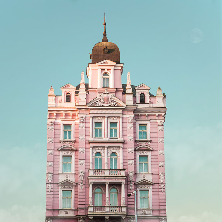
Hotel Opera, Prague (c. 1890). Photo: Valentina Jacks
So what makes something accidentally Wes Anderson? Koval’s introduction mentions ‘symmetrical lines, pastel hues, immaculate composition, or something idiosyncratic and beautiful that you can and cannot describe at once’. Colour is definitely important, and the palette specialises in fleshy pinks, sherbet orange, egg-yolk yellow, assorted mints and a good deal of teal. The architecture is heterodox, ranging from the neoclassical and baroque to the modern and utilitarian, but there’s not much later than 1950. Hotels, theatres, palaces and swimming baths are heavily represented – there’s a thread of luxury, but also a sporty, outdoorsy air. Symmetry is accompanied by a lot of regimentation: neat lines of windows, ranks of empty seats, colonnades and so on.
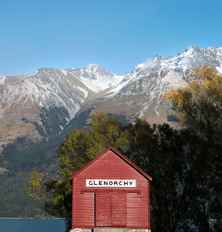
Besides this formality there’s a miscellany of informal structures: ice-fishing shacks, bathing machines, out-of-the-way chapels, various booths and cabins, all the miniature worlds that so intrigue children. In this same category of delight are a Richard Scarry-esque fleet of vehicles: camper vans, cable car gondolas, snowcats, rowing boats. What unites this consciously charming assortment with the grander fare above is the way everything is shot. Every picture is firmly centred in the frame, as straight to the lens as a passport photo. There are Dutch gables but no Dutch angles. If I have strayed too deep into lists, it’s because a taxonomical atmosphere clings to the enterprise, an effort to collect and categorise.

Roberts Cottages, Oceanside, California (c. 1928). Photo: Paul Fuentes
Koval presents the book as a travel guide, a ‘personal travel bucket list’ compiled with his wife Amanda, and it began life as a website and Instagram account. The pictures are gathered from scores of other Instagram accounts, detailed in an index at the back (on the page might have been better). Short captions fill in a little information about what’s shown, but too often err towards Instagrammy superficiality. This entails occasional chatty looseness with the details. Kyiv, in 1898, is described as having ‘been under Soviet rule for centuries’. Captain Webb’s pioneering Channel swim is said to have sparked ‘a mania for swimming up and down the country’, which is an arresting image.
Inspiration for the armchair traveller is more the line than actual practical guidance. I don’t think anyone will make the trip to Mirny in the Arctic Circle to check out the awning on the front of its local radio station, however attractive its weathered shade of blue. These are pictures to look at, not places to go – and, indeed, there are only a handful of people pictured in Accidentally Wes Anderson. Ceremonial guards outnumber civilians. Mostly the frame is deserted.
Actually being there wouldn’t have the same effect at all, because we are dealing with an ideal. In Eccentric Spaces (1977), the architectural theorist Robert Harbison suggested that as architecture is an art form that ‘does something’, that serves a purpose, books centred on buildings ‘feel they have made a more definite assertion than another “what if?”’. Imagining buildings is easier than building them, so buildings in fiction can be more satisfying, more meaningful, more perfect. They can offer up their secrets more readily, and disclose more about their inhabitants. This has much of value to both writer and reader but has a convenience that is almost a crutch: ‘The faith in geometry leads to a magic of spatial arrangements, in which life’s difficulties will be solved by positioning things properly and making prescribed movements.’ And so it feels with Anderson’s movies. The material universe of their setting is so rich, so meticulous, that it seems to govern what happens within. Accidentally transposes that fiction to reality, and suggests that it exists layered in with the everyday.
This all sounds rather dictatorial, and it is, in the same way that all totalising aesthetic visions are. Is it possible to imagine a book like this for another director? Accidentally Stanley Kubrick? Accidentally Christopher Nolan? It could be done, but I doubt it would be as seductive. Fundamental to the appeal of the Andersonverse is its deep ambivalence and tameness. The grandeur is accompanied by Ruritanian bathos. The pomp takes place in slightly reduced circumstances. Its high tech is a few decades past it and haunted by obsolescence. There are a lot of signs and notices in Accidentally Wes Anderson, and they are generally hand-painted or stencilled – neatness and officialdom express themselves with a slight wobbliness. In the real world, pastel perfection occasionally strays into the sinister – the nightmare kitsch of North Korea makes more than one appearance.

Wharf shed, Glenorchy, South Island, NZ (c. 1885). Photo: Frida Berg
Broadly, however, the atmosphere is benign, if melancholy. Nostalgia? In abundance. Everything has its best days behind it, or is more memory than experience, the stuff of yesterday’s travels rather than tomorrow’s. This is the quality that Anderson wields so effectively in his films. In The Royal Tenenbaums (2001), we see only an after-impression of the precocious glory days of the dispersed and bitter Tenenbaum family. In The Life Aquatic, the adventuring Steve Zissou’s equipment (and music) are decades past their prime, with tragic consequences. In The Grand Budapest Hotel (2014), the ‘present day’ hotel is doubly reduced: even the 1970s decor that replaced the pre-war splendour is now exhausted. But the energy that Anderson brings to the screen carries with it the promise of renewal, and that haunts these pages as well.
The reviewer’s job of recommendation is in this instance extremely easy: if you enjoy the films of Wes Anderson, you’ll enjoy this. I do, and I did.
Accidentally Wes Anderson by Wally Koval (with Amanda Koval) is published by Trapeze.


![Masterpiece [Re]discovery 2022. Photo: Ben Fisher Photography, courtesy of Masterpiece London](http://zephr.apollo-magazine.com/wp-content/uploads/2022/07/MPL2022_4263.jpg)
‘Like landscape, his objects seem to breathe’: Gordon Baldwin (1932–2025)